Isrotel Hotel Chain
Rebranding
Our life project. B/T Design studio has accompanied the Isrotel chain since it opened its first hotel, King Solomon in Eilat in 1984. The chain’s old logo was designed by a studio from London even before our arrival, the symbol was shaped from a wave and sun producing the letter i, the first letter of the word isrotel, and it implies a beach vacation.
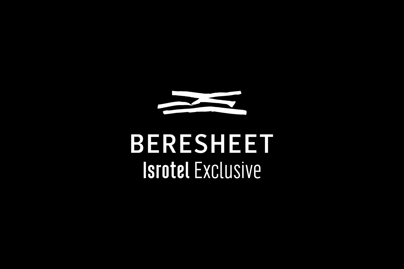
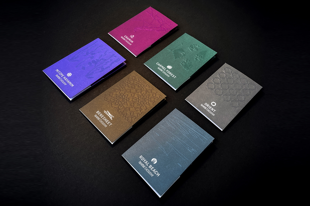
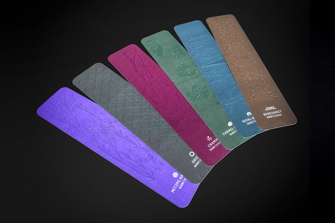
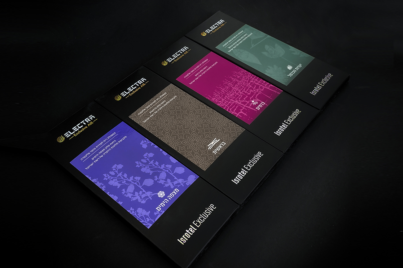
In 2011, along with the opening of the Beresheet Hotel, Isrotel opened the new Isrotel Exclusive Collection line, which offered an exclusive vacation, different from what the hotels that existed until then offered. Today, the line consists of six more hotels: Cramim, Carmel Forest, Orient, Mitzpe Hayamim, and the Royal Beach Hotels.
Today, the Isrotel chain is in the process of growth, change, and expansion: from a chain that started as a chain of Eilat hotels to a national chain, which offers a variety of types of vacations. In the coming years, a large number of Isrotel hotels will open in Tel Aviv and the customer base will grow from an Israeli audience to a combined audience of Israelis and tourists.
The Isrotel chain rebranding process begins with the primary logo and touches on the entire brand architecture.
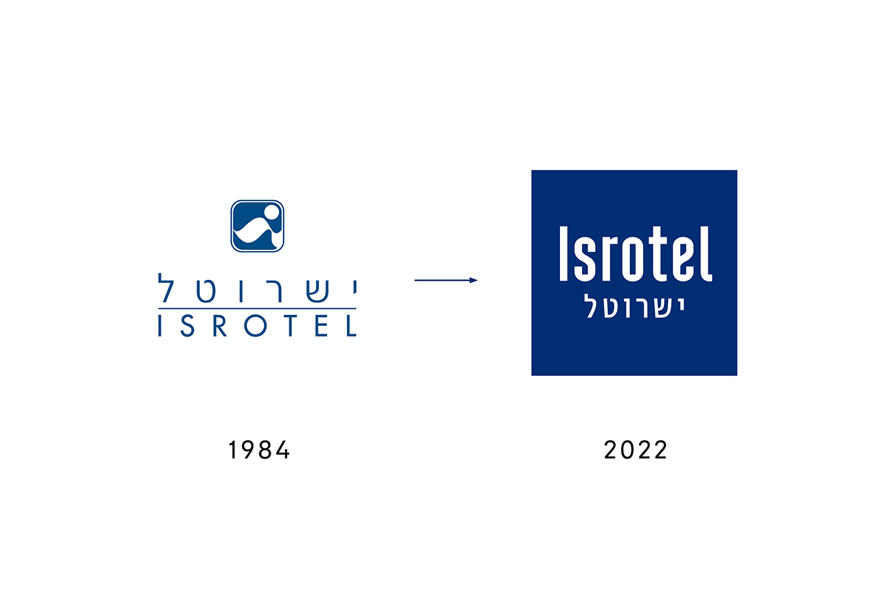
Isrotel logo: We chose to say goodbye to the old symbol of the “wave” that symbolized a specific type of vacation. The future of the chain lies in a wide variety of vacation types: family, couple, business, urban, or luxury.
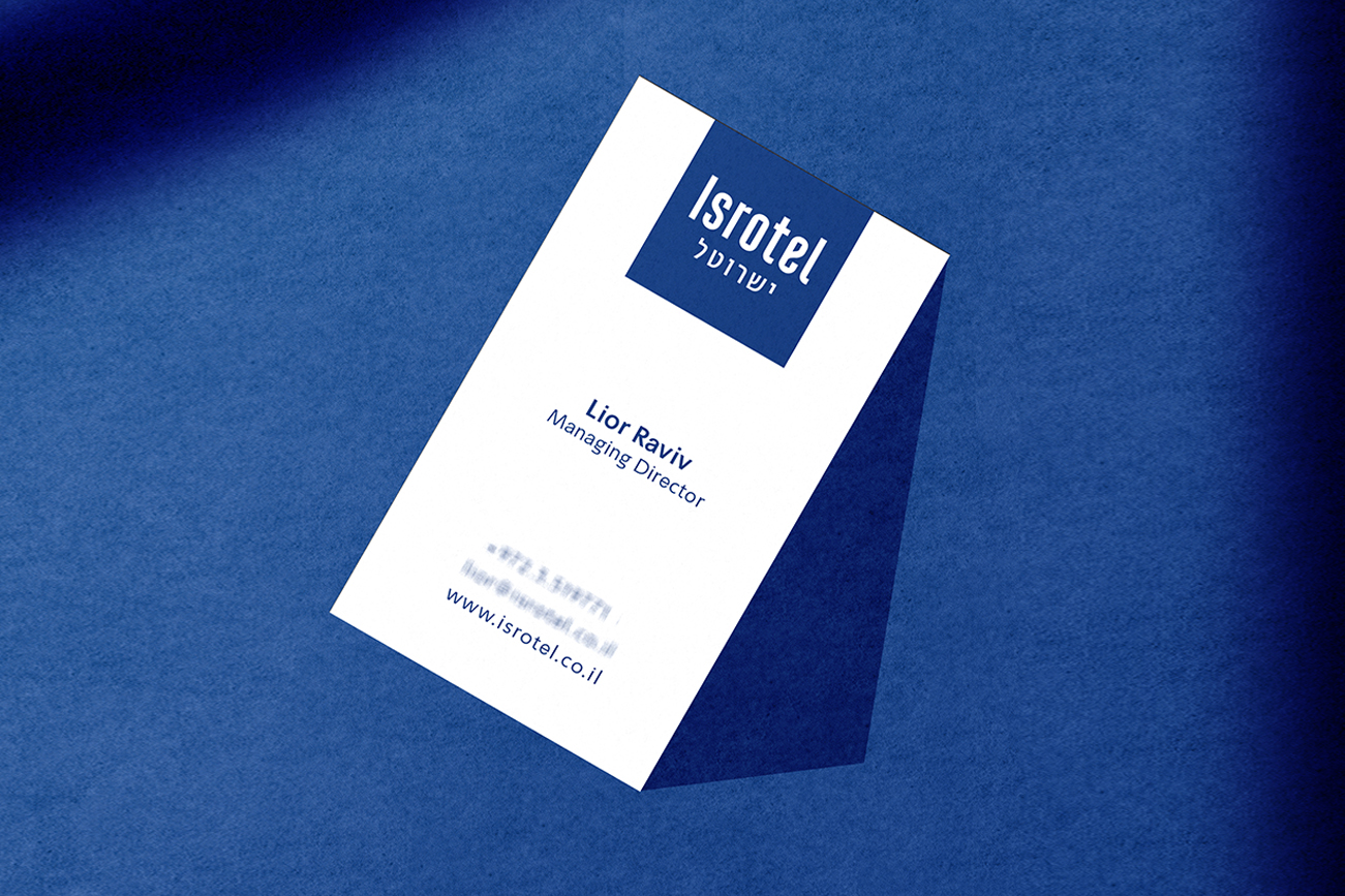
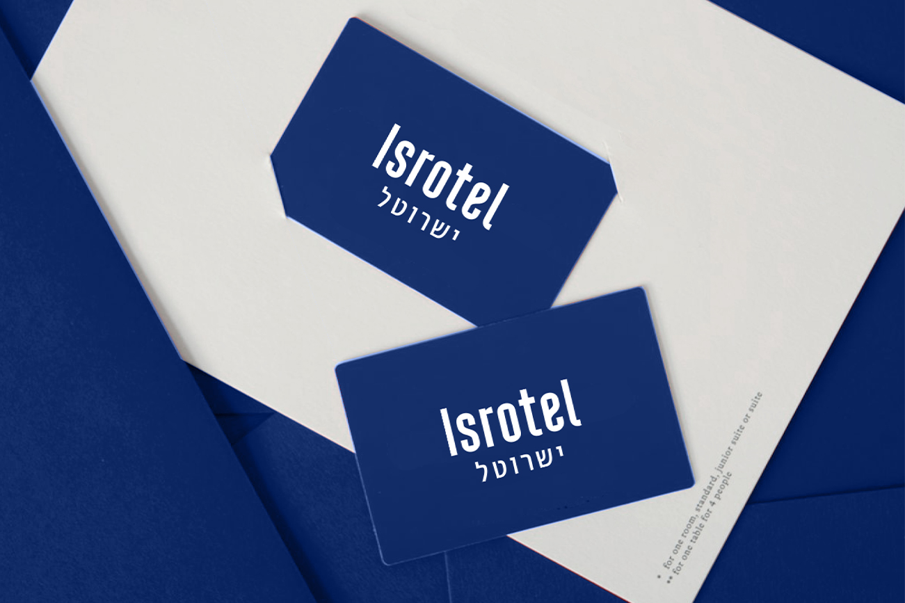
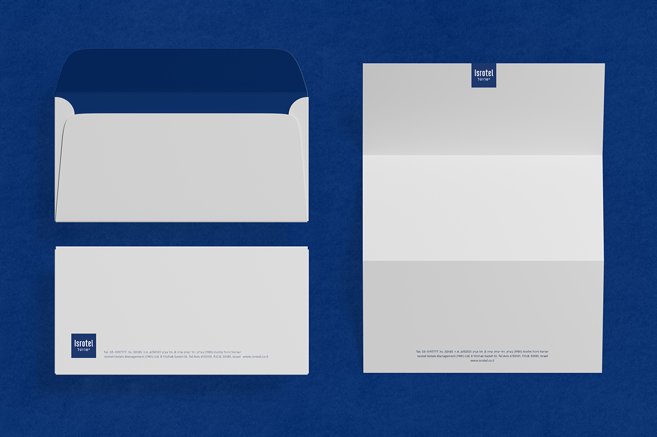
The new Isrotel logo appears in English and below it ‘Isrotel’ in Hebrew. We refreshed the blue hue of the logo and preserved the company’s significance as an Israeli-Zionist company. The Isrotel logo is a dynamic logo that adapts its shape and color to fit into the logos of the various hotels and segments.


Brand architecture: We have re-divided the chain hotels into 3 segments that offer different types of vacations and characterized each segment in a leading color:
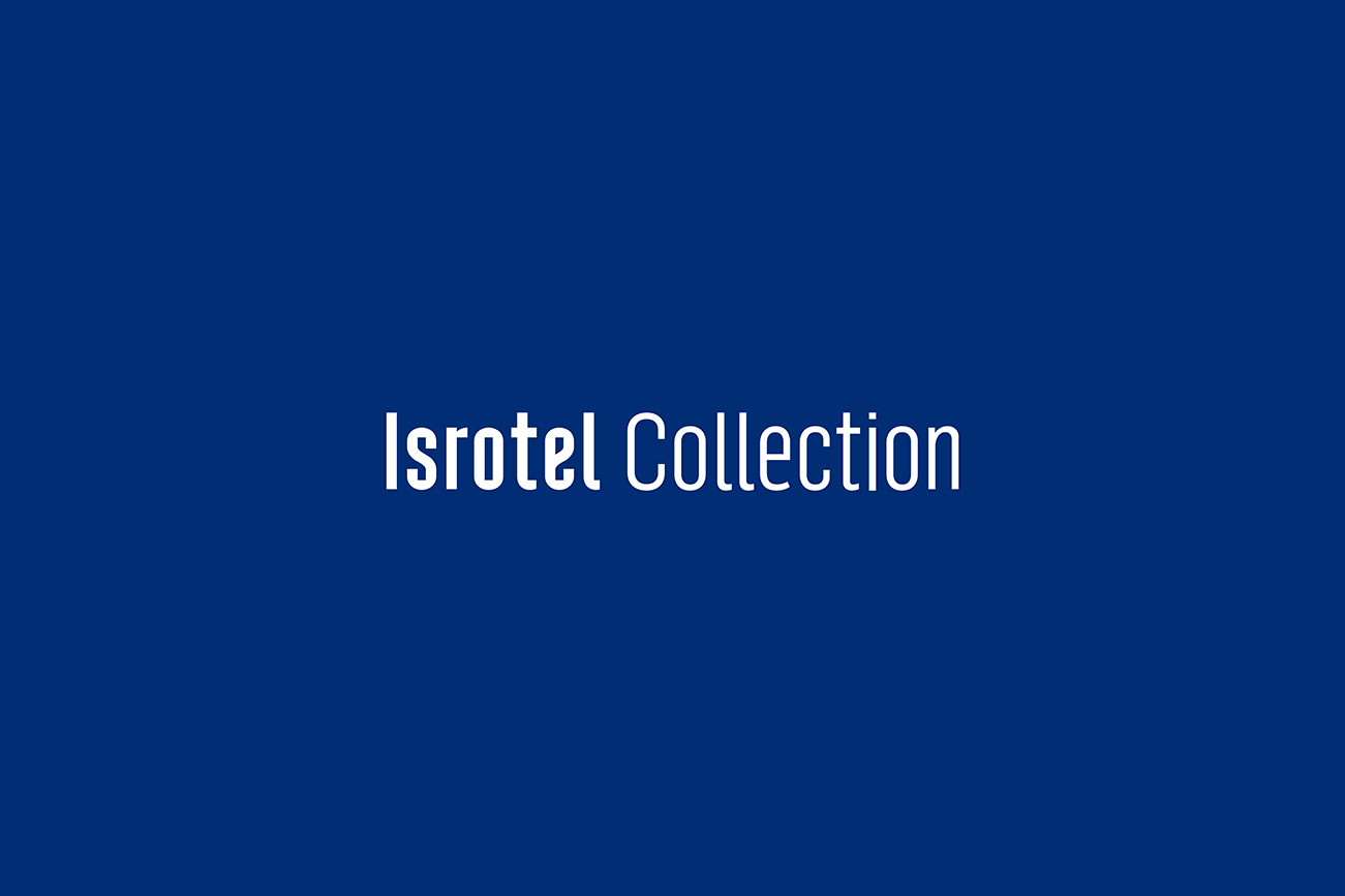

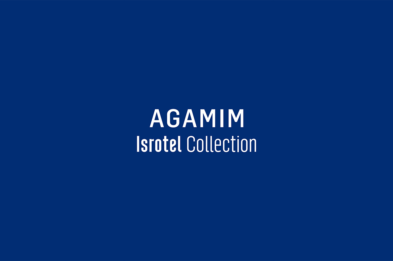
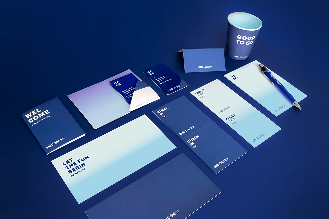
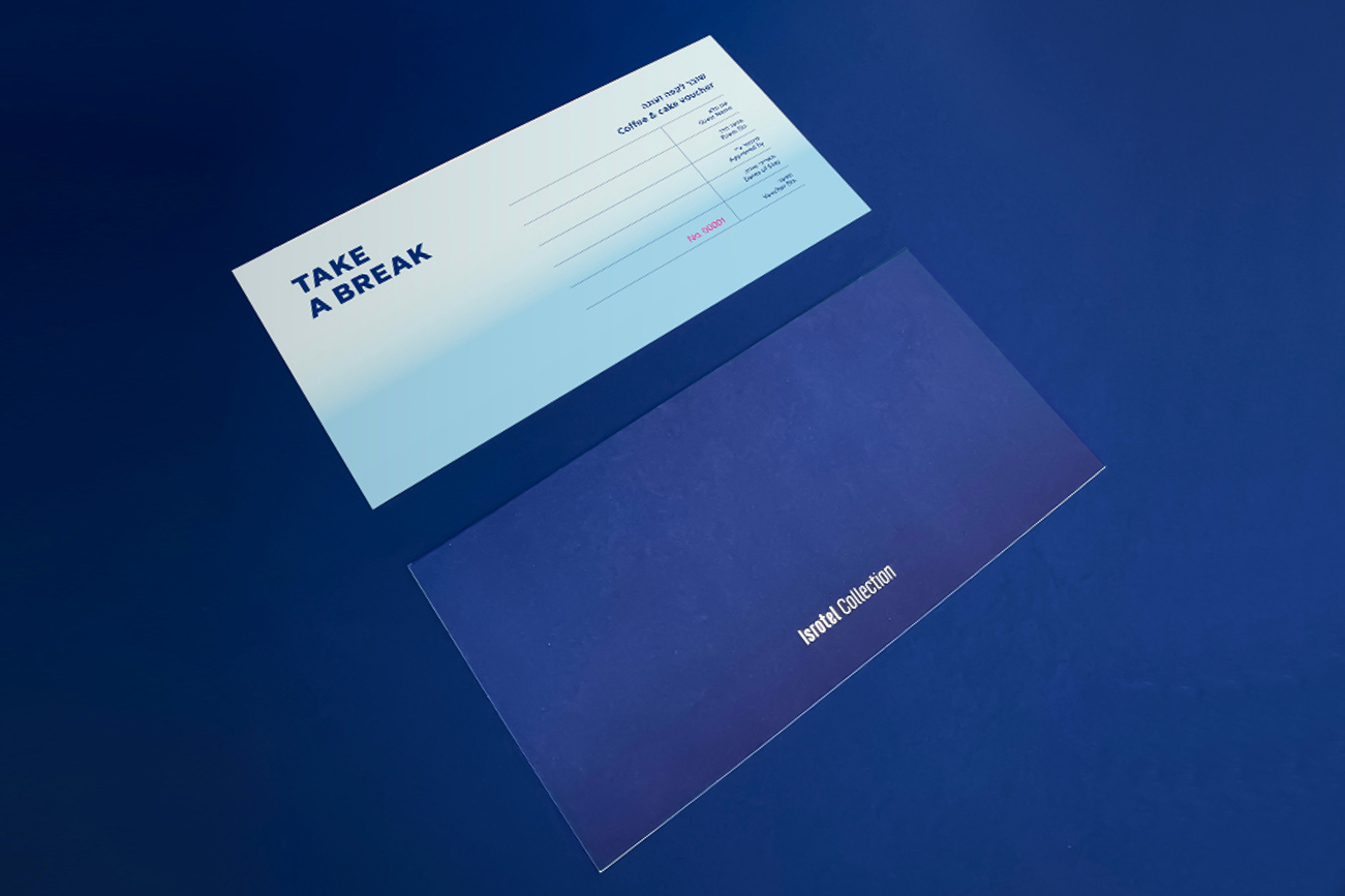
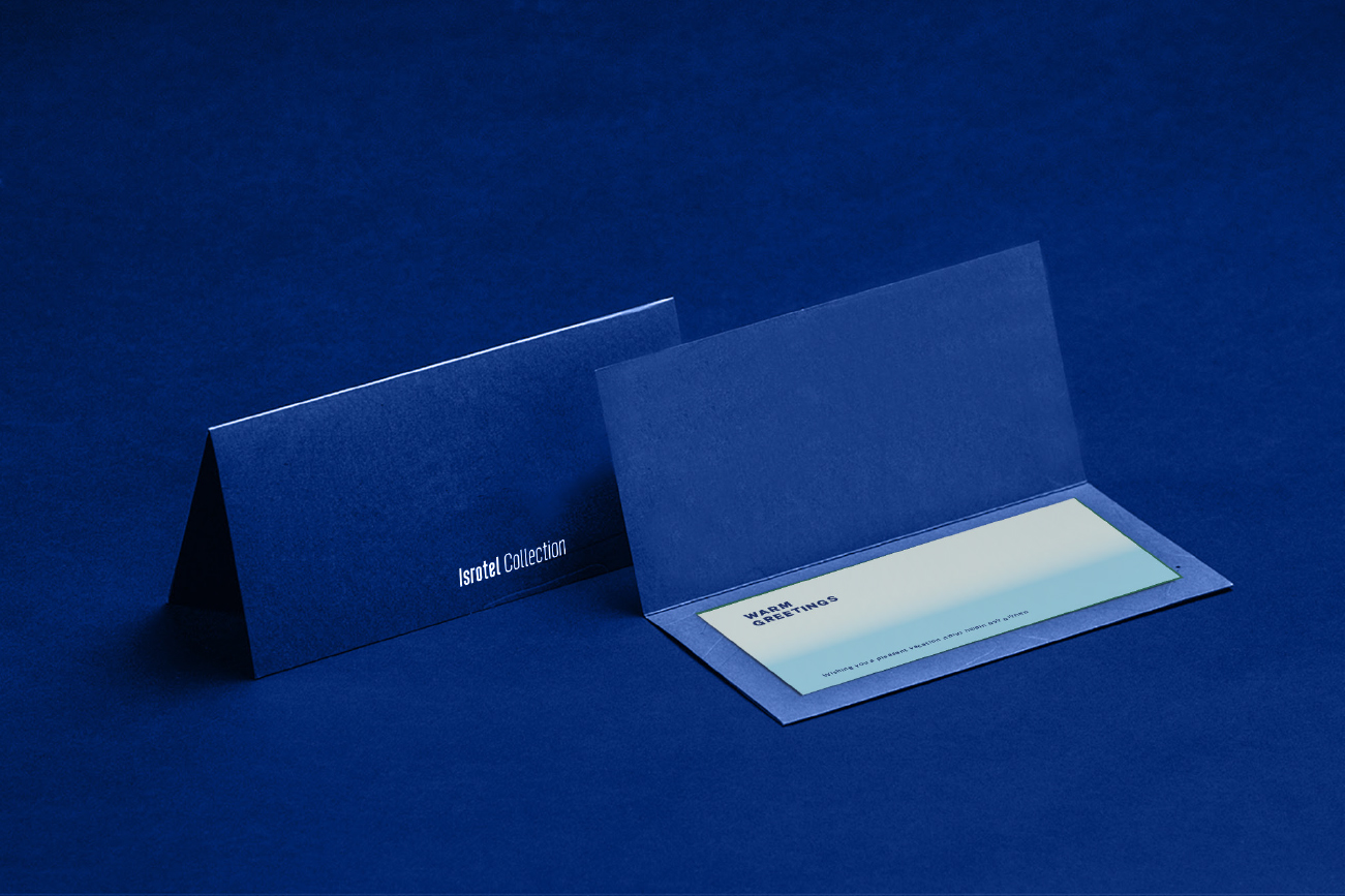
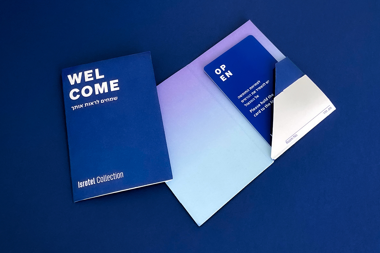
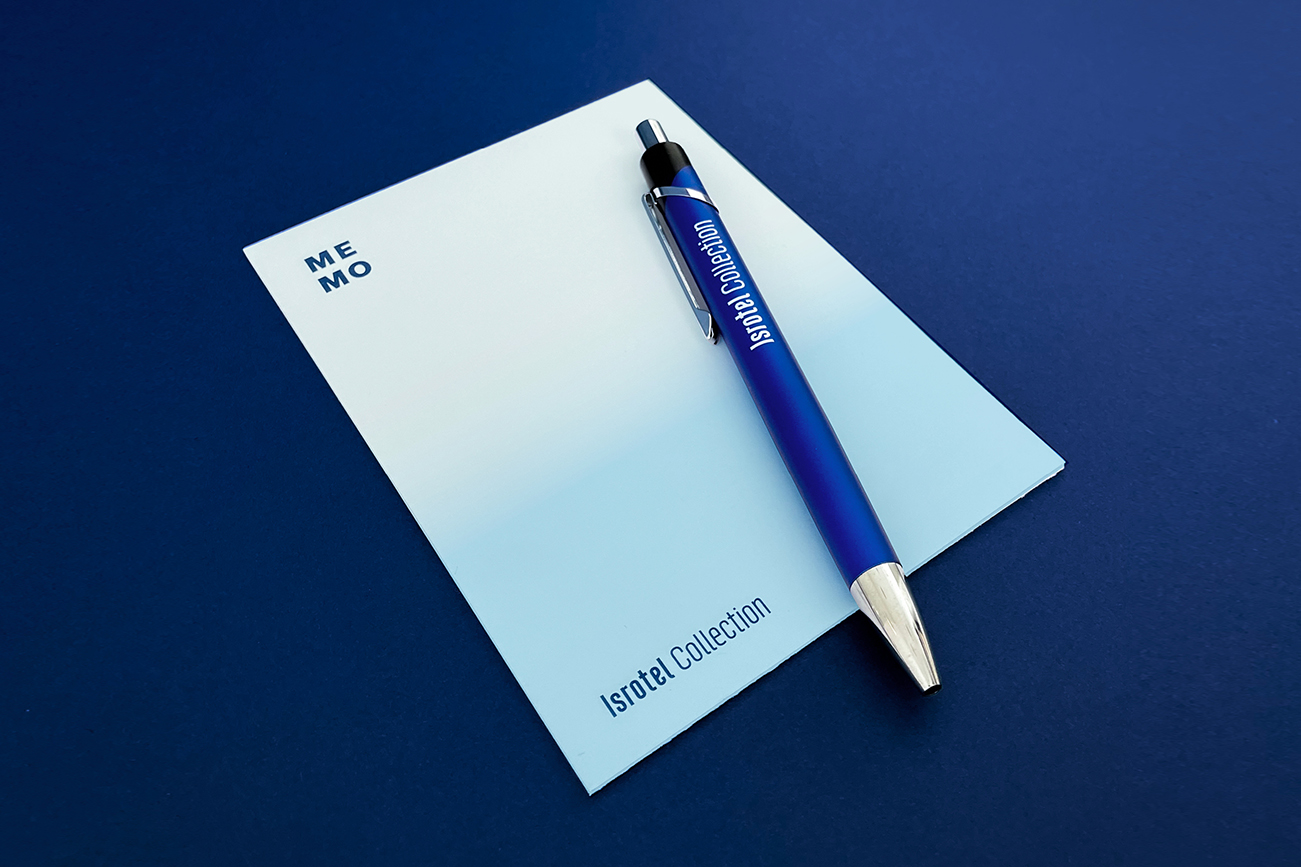
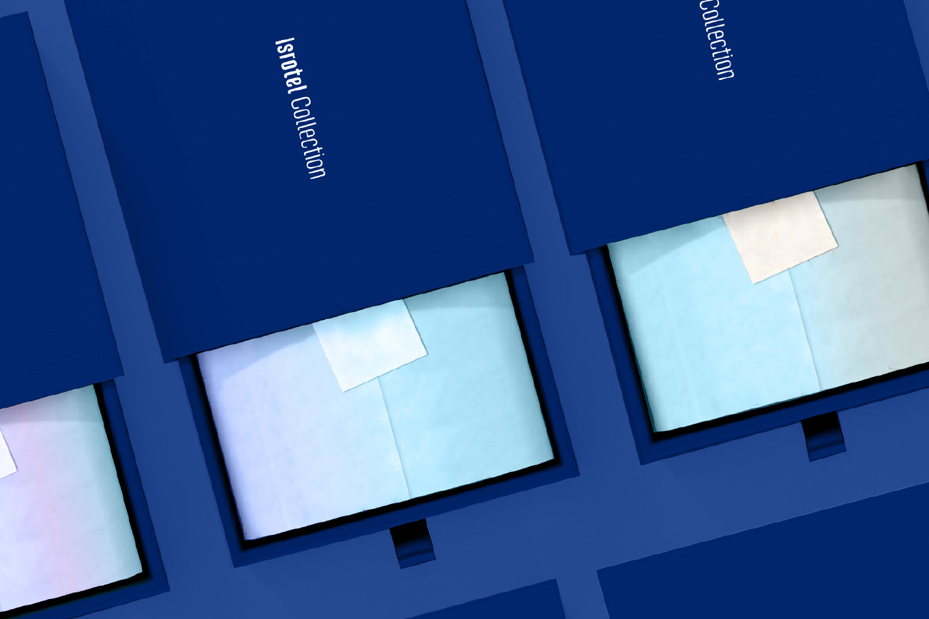
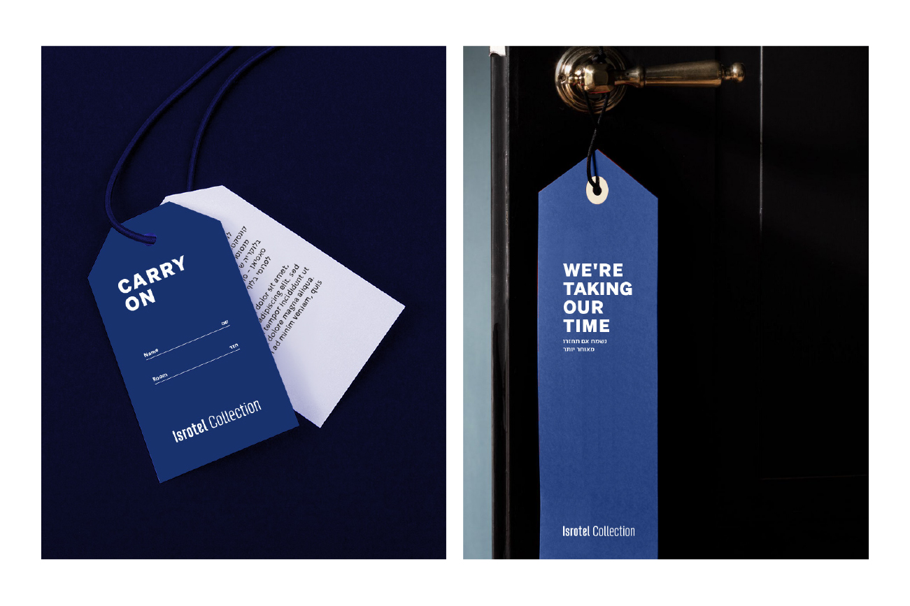
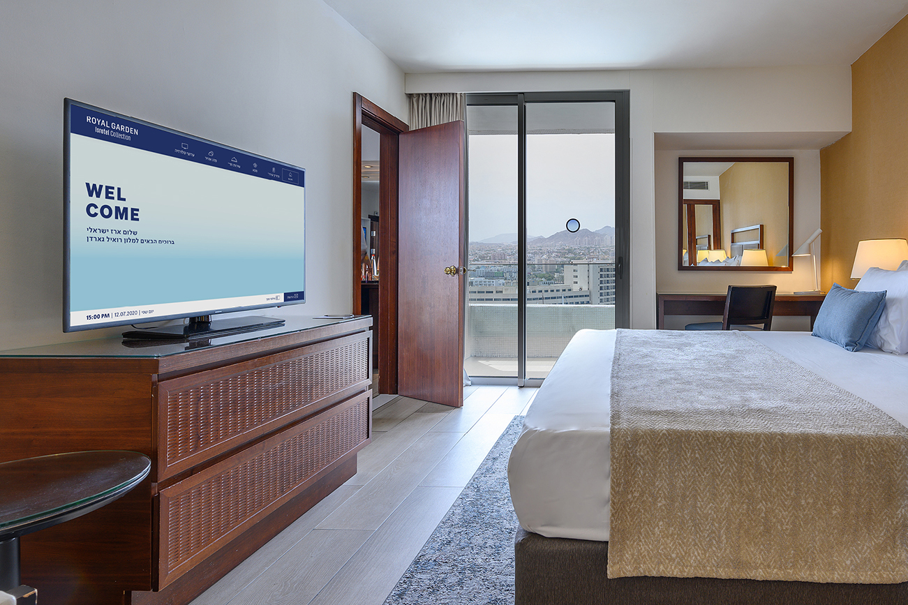
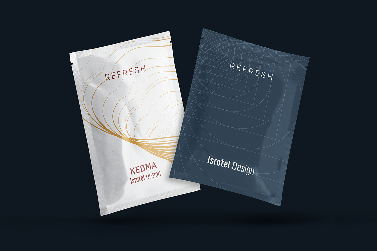
Isrotel Collection: Resort hotels suitable for every character and budget of a vacation. The blue line is the high standard of the Isrotel chain.

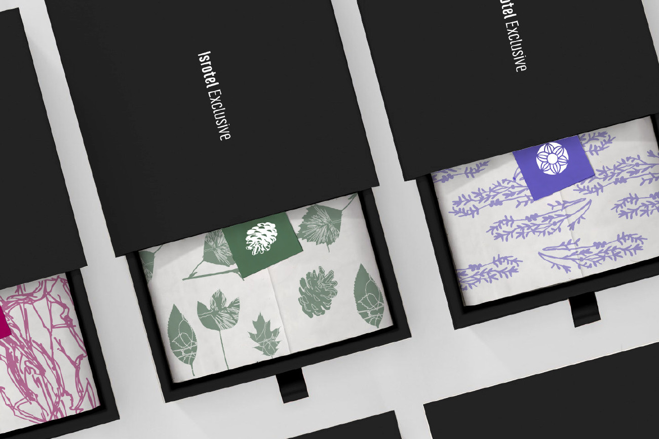
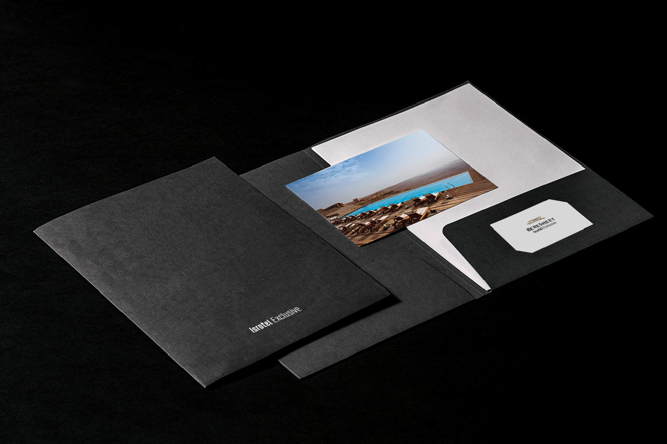
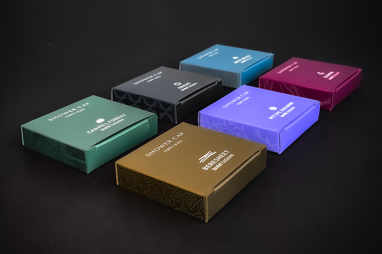
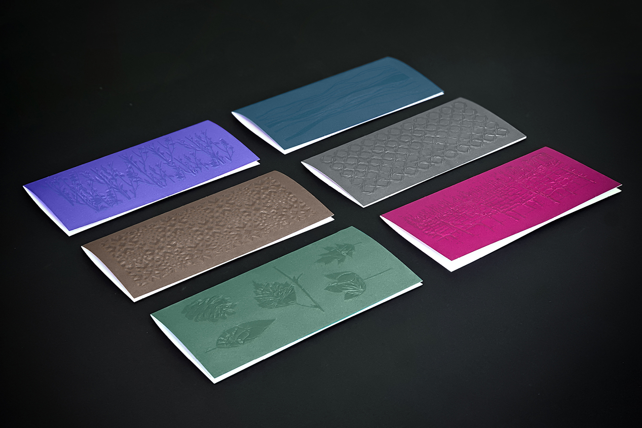
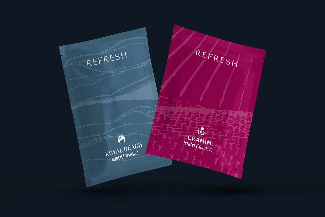
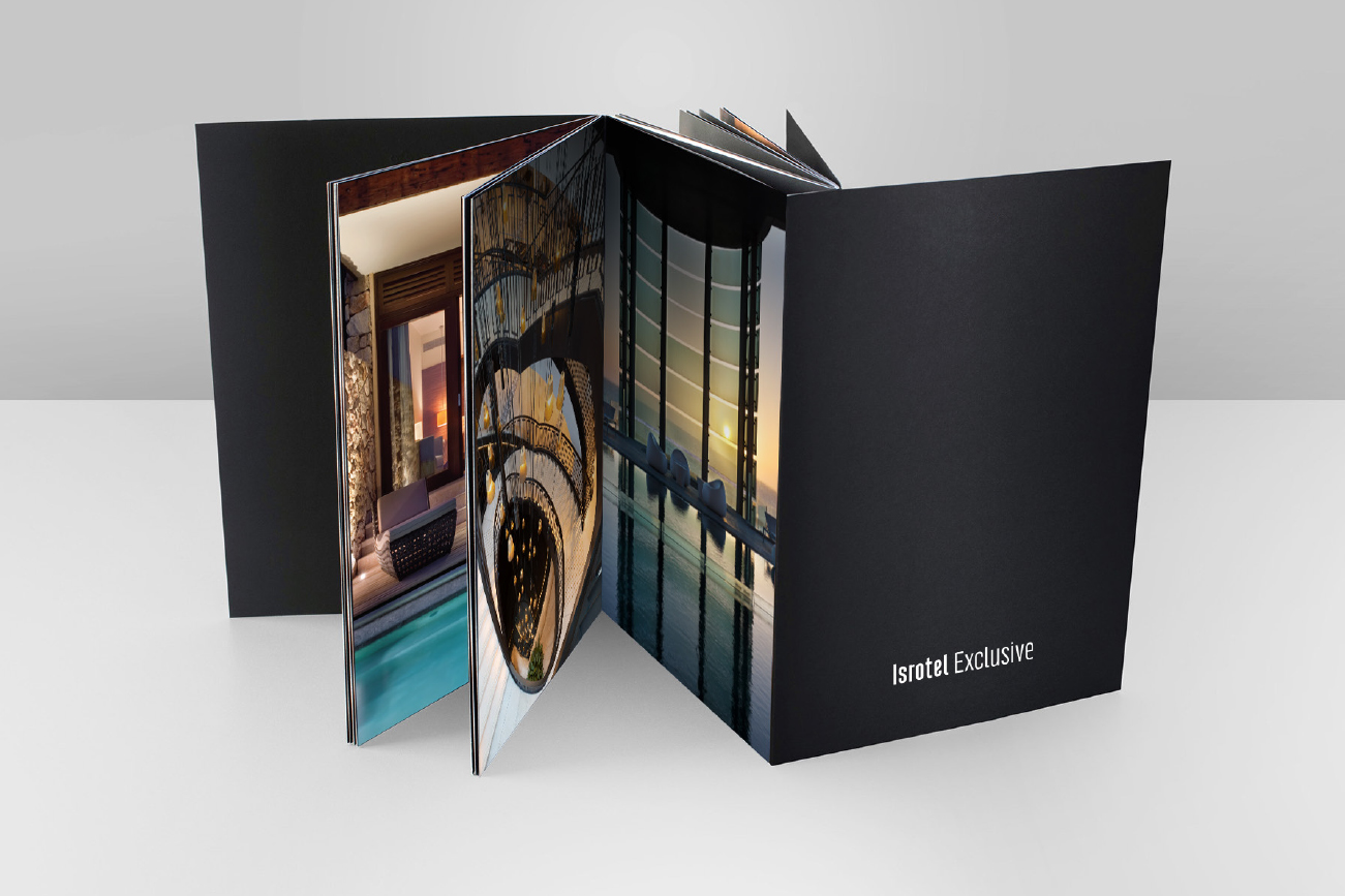
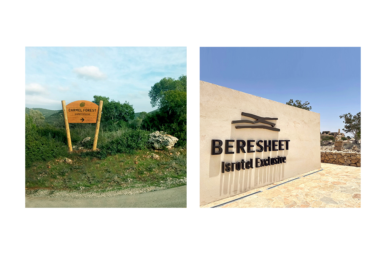
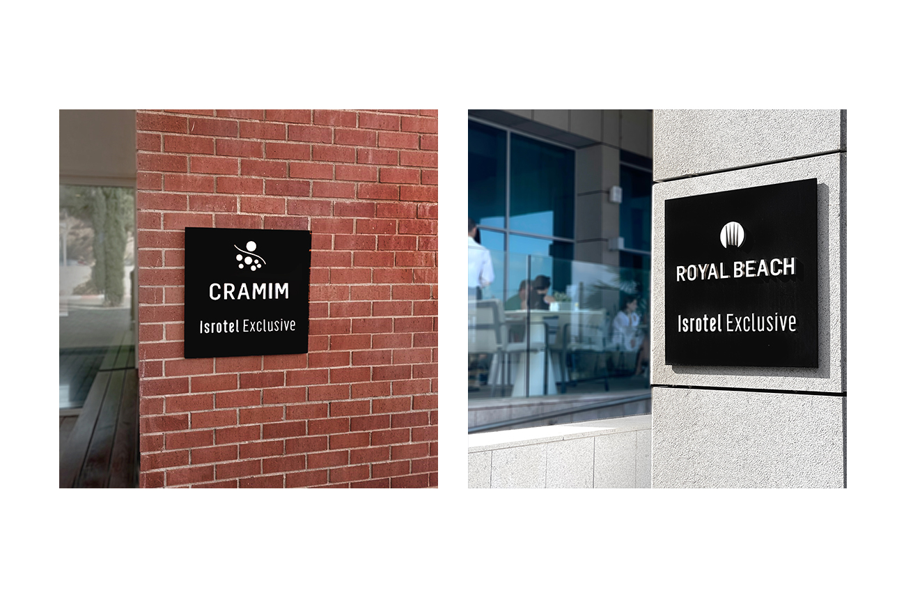
Isrotel Exclusive: The chain’s luxury hotels are of the highest standard that produces an excellent hospitality experience. The exclusive line of the chain is black and each exclusive hotel is characterized by its unique color.
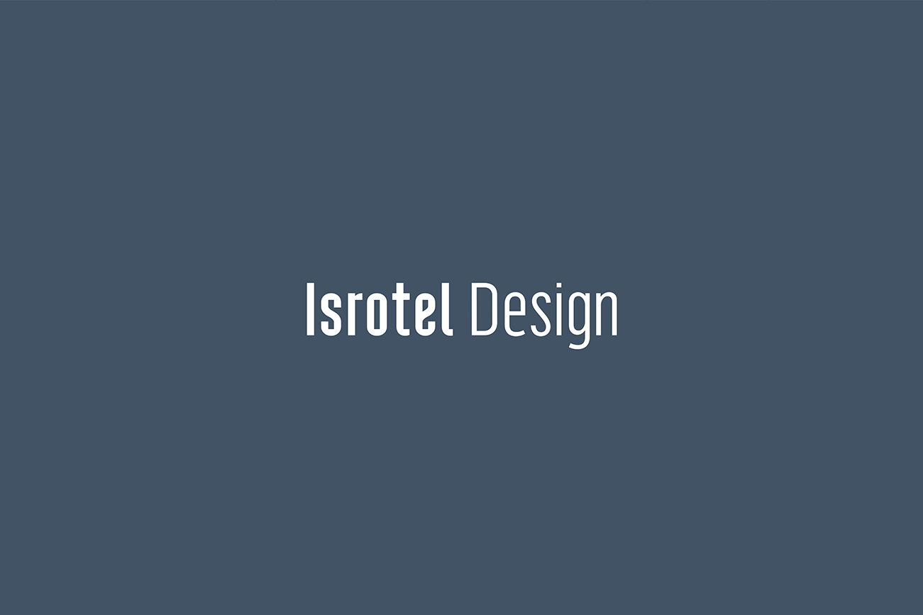
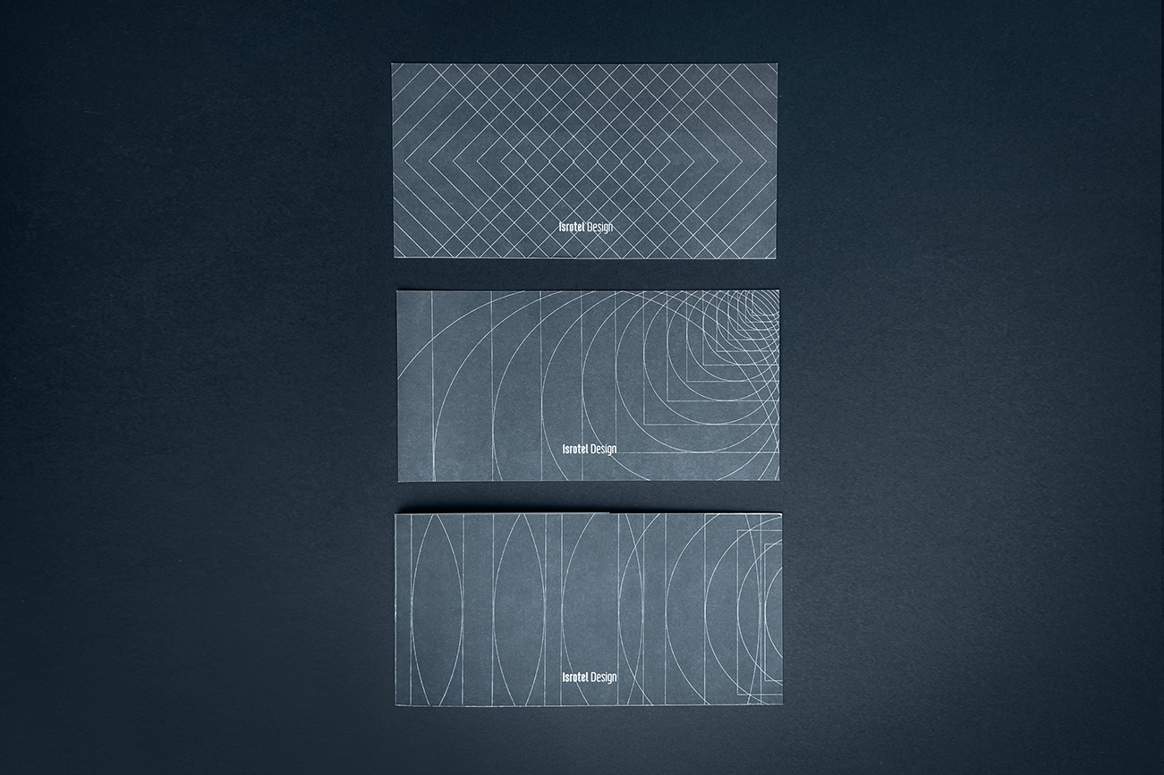
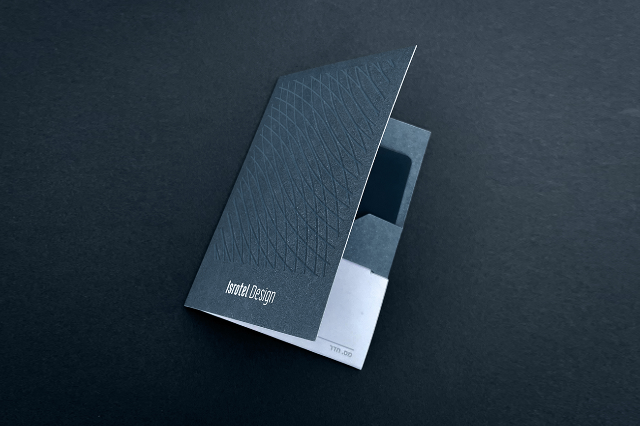
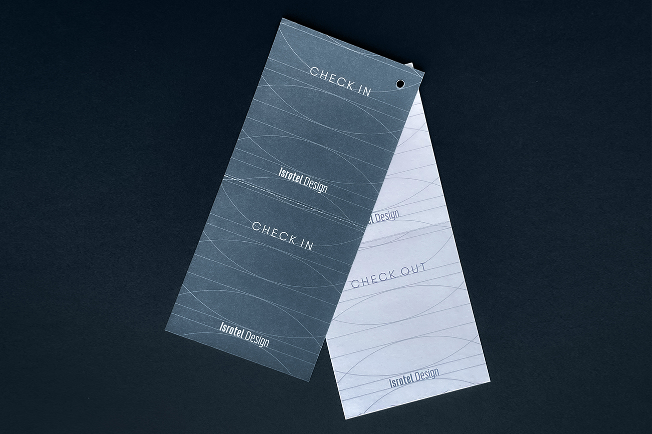
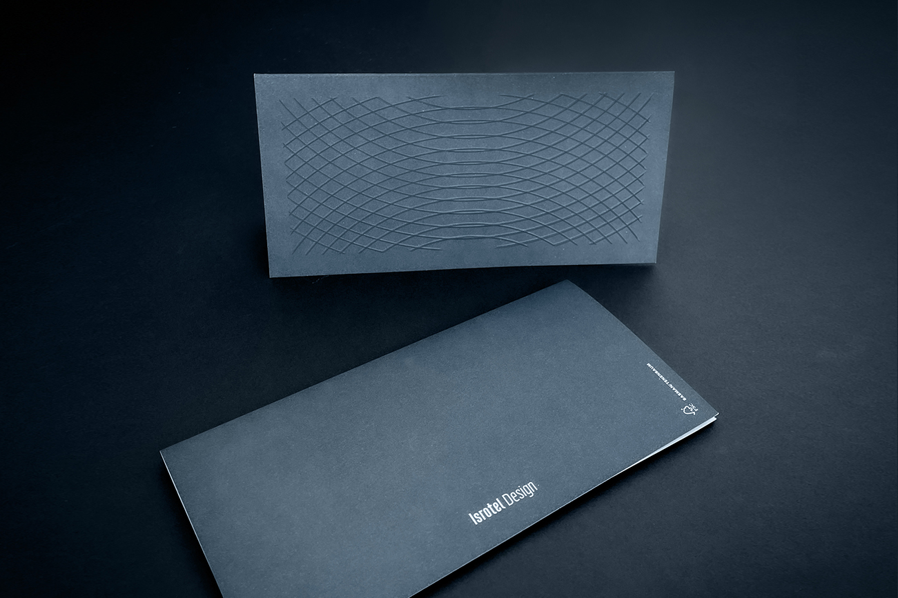
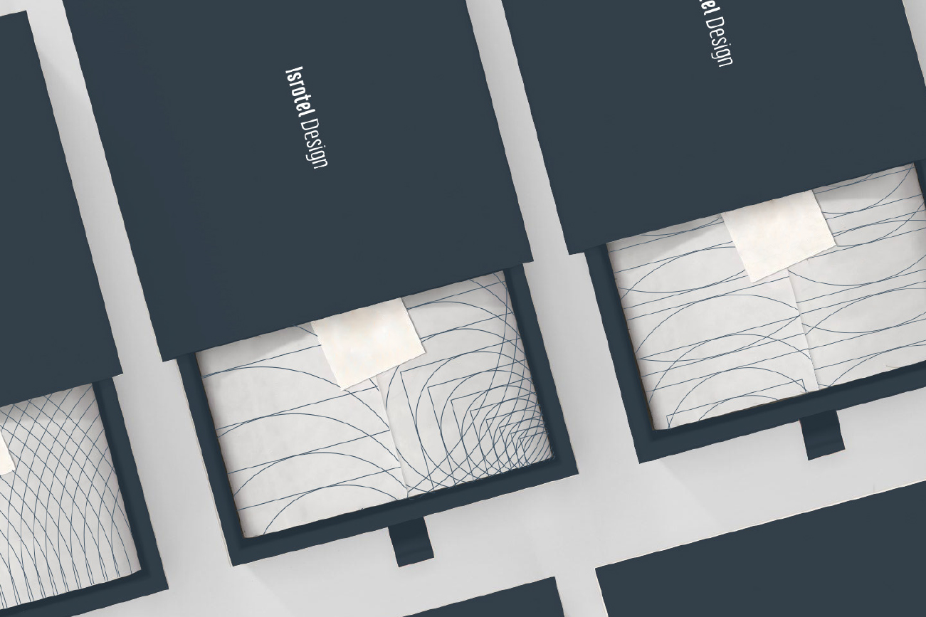
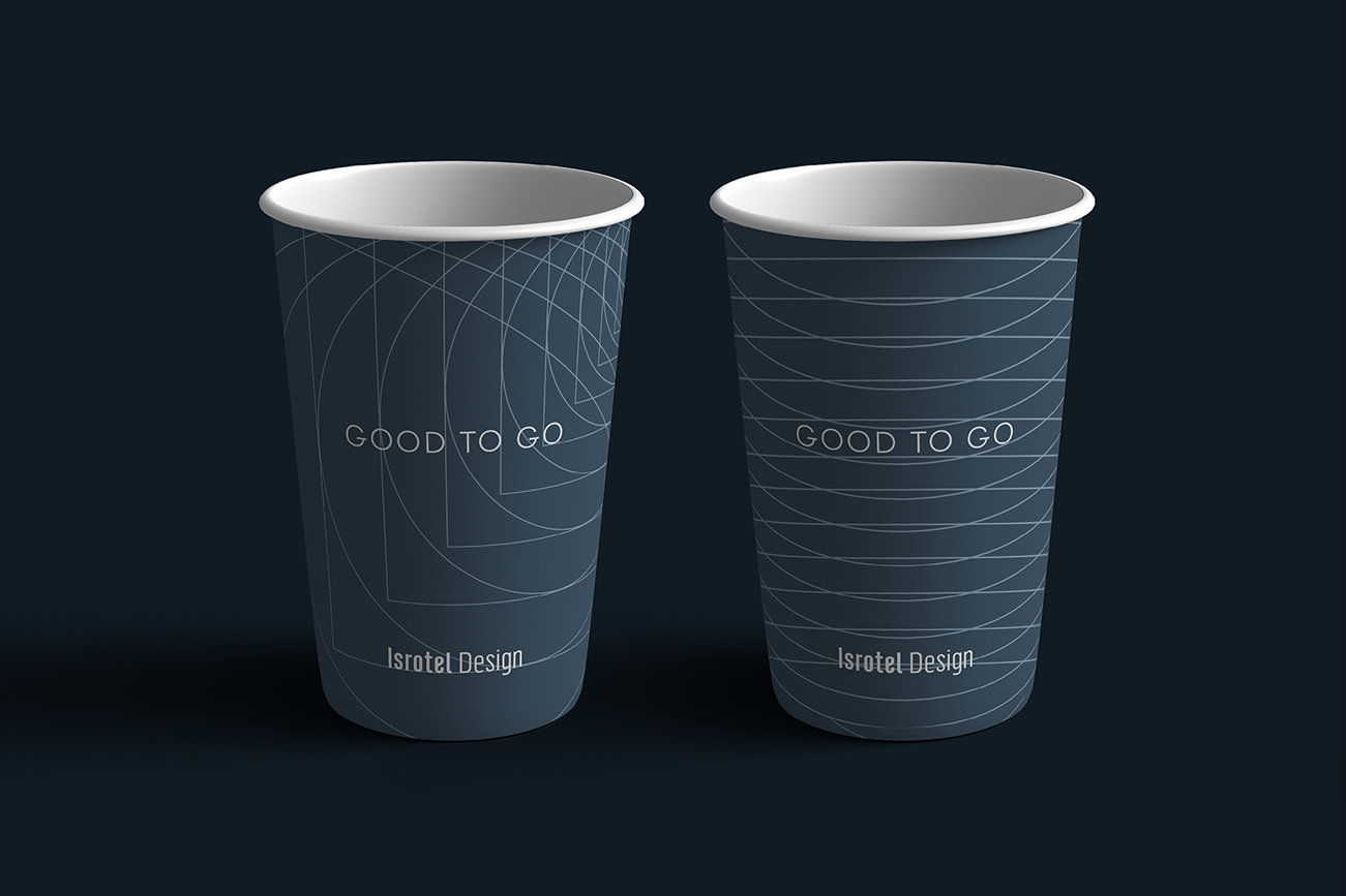
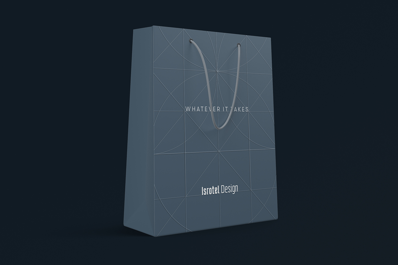
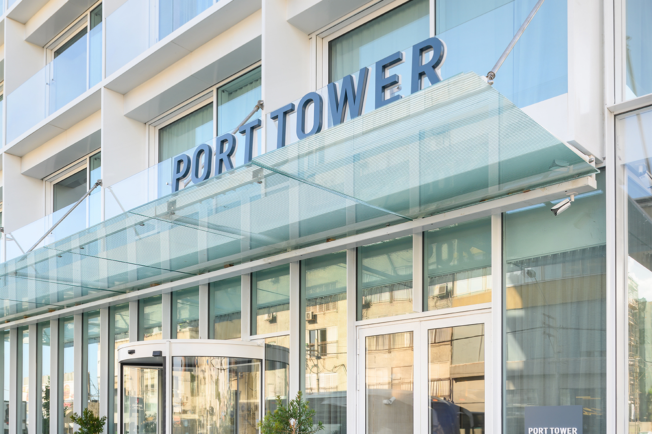
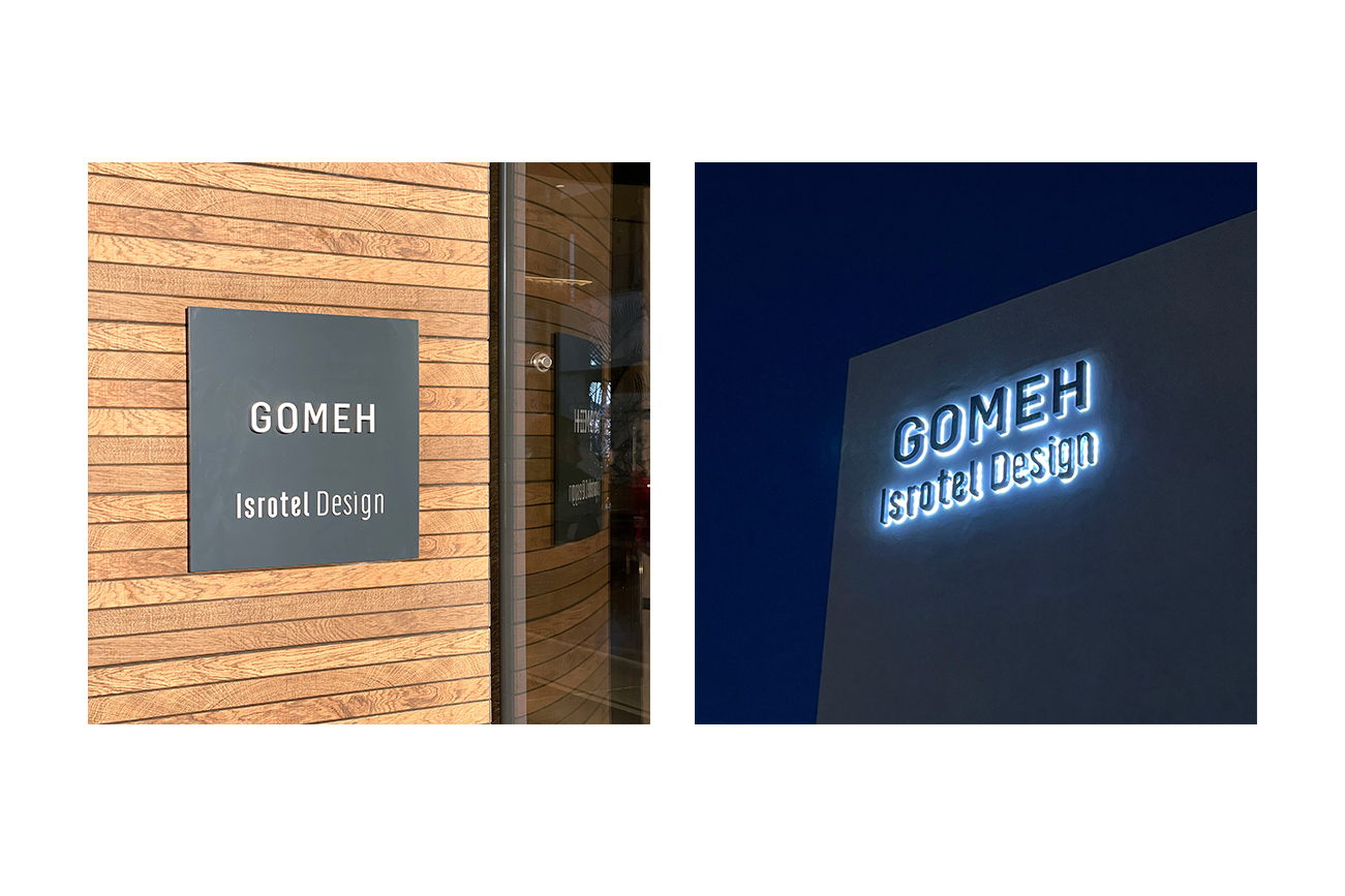
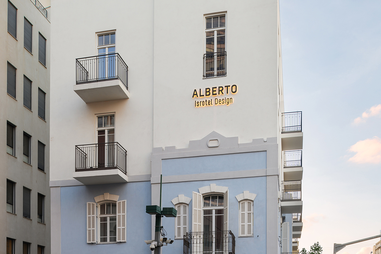
Isrotel Design: The chain’s new gray line. Hotels that guarantee a contemporary and stylish design experience, are located in central locations close to cultural attractions, entertainment and, travel.


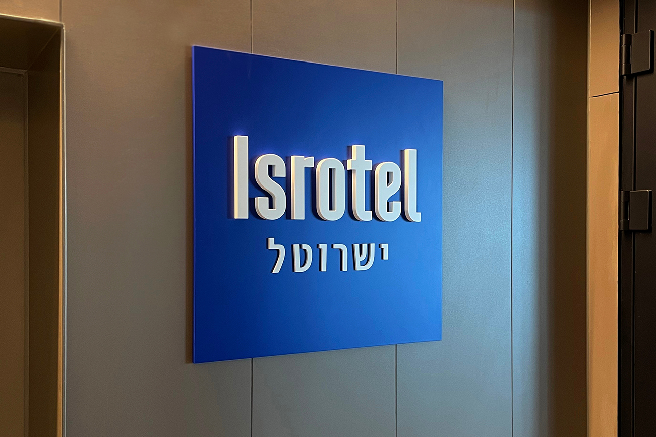
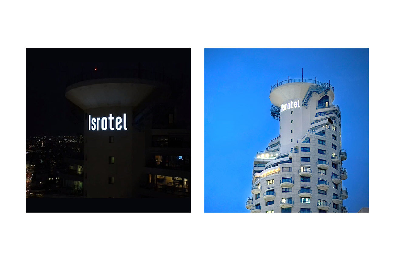
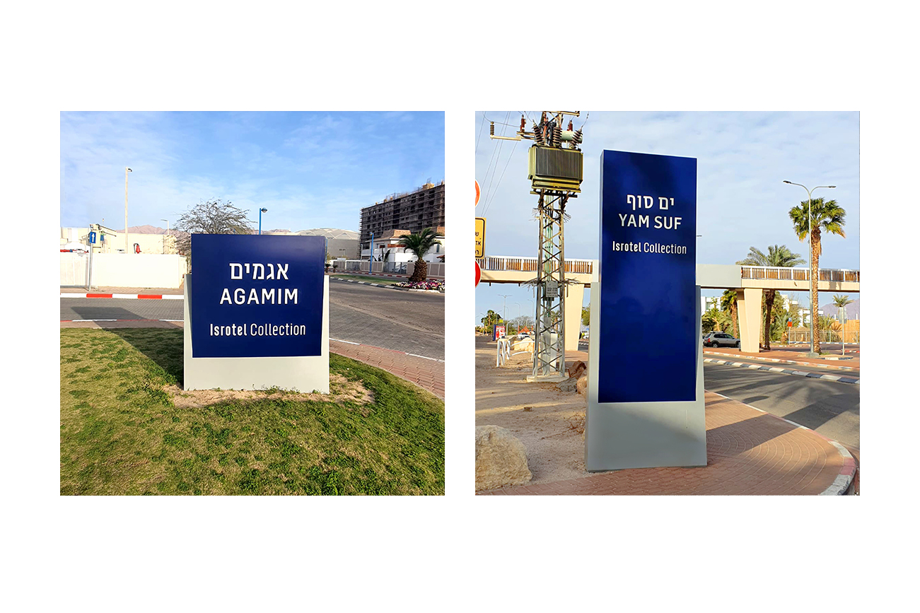
Signage: As part of the rebranding process, we redesigned the exterior signs of all the chain hotels. At the entrance of each hotel, we placed a square sign in the color of the segment with the name of the hotel. And at the top of the buildings, we designed new and illuminated signs. Manufactured by Rothschild Signs.
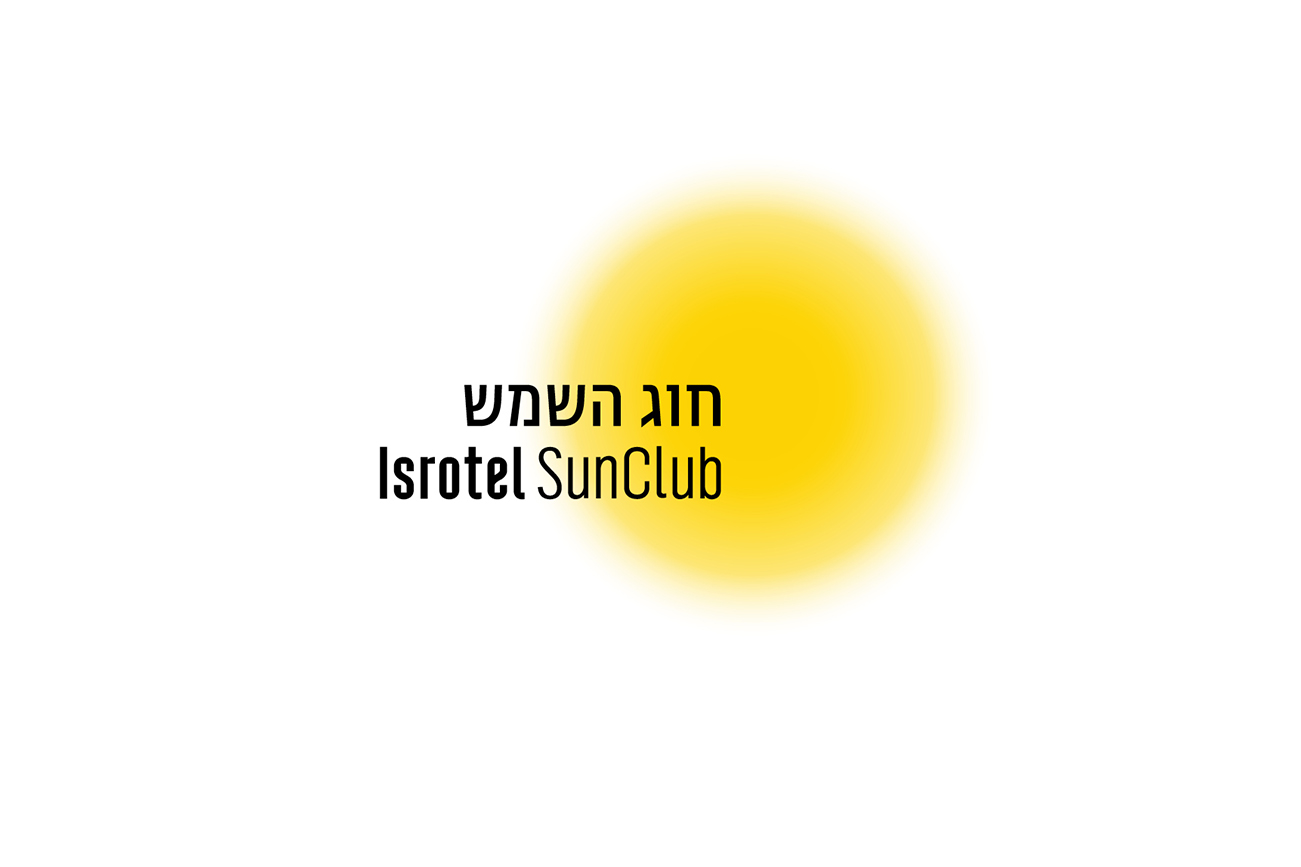
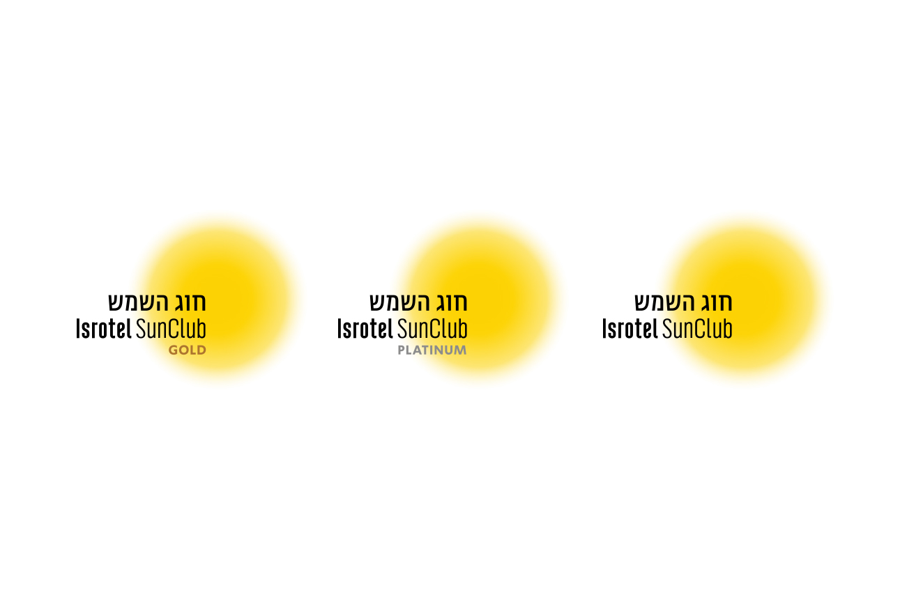
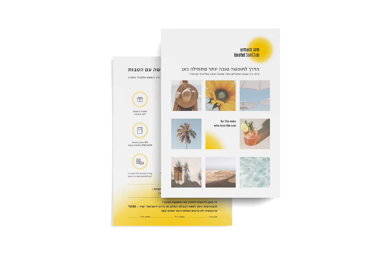
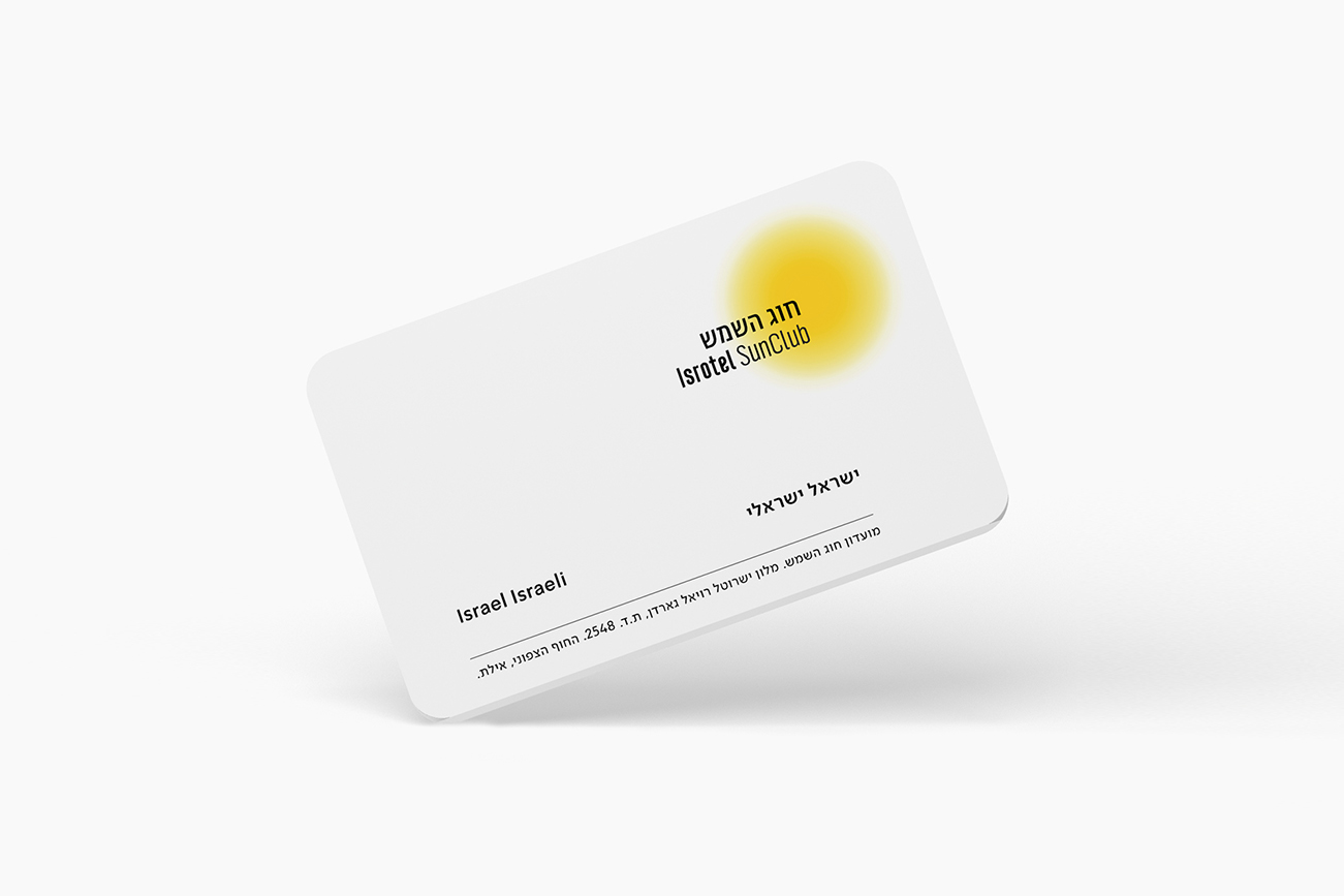
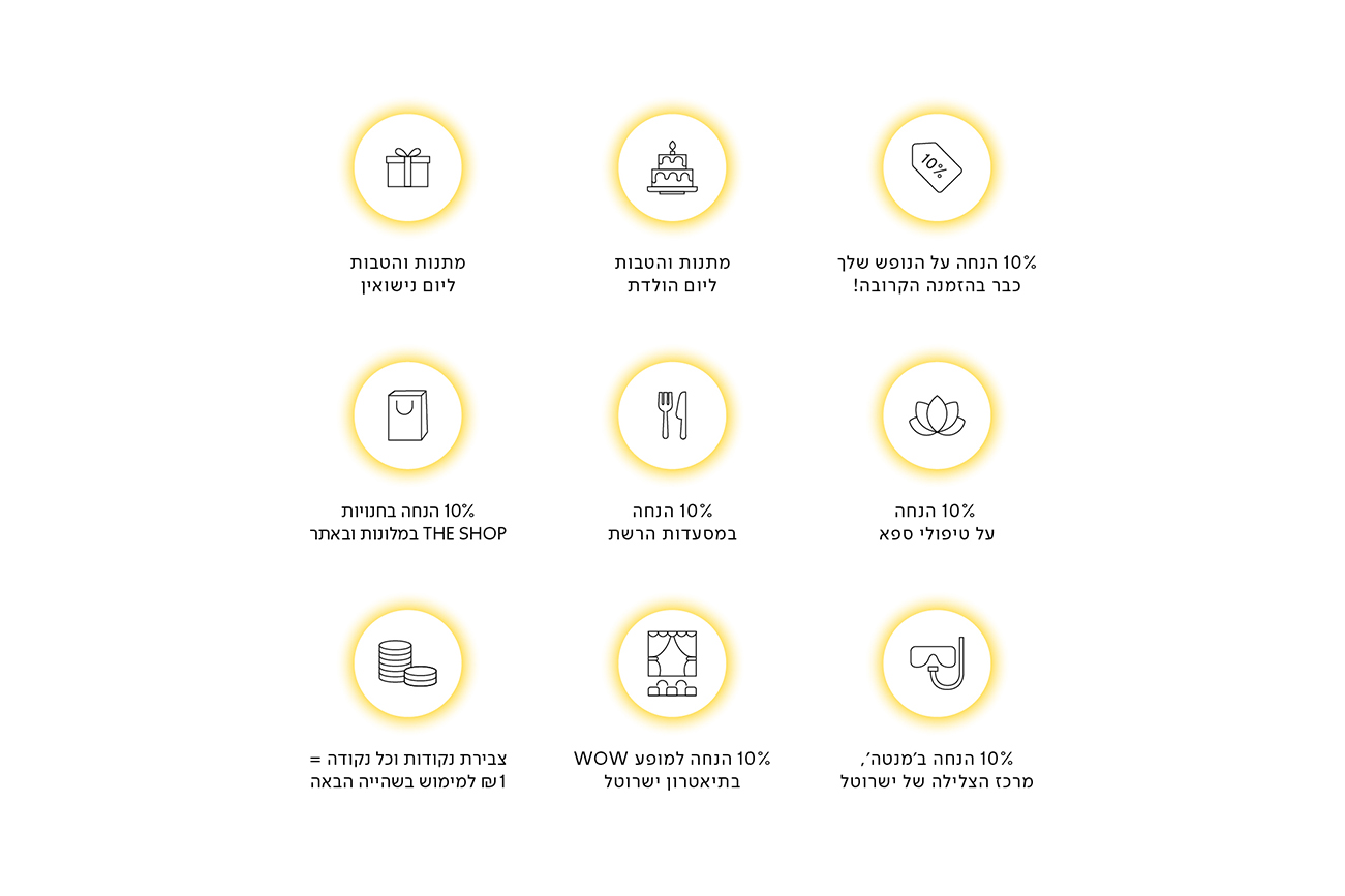
Isrotel Sun Club, Isrotel’s customer club: Members of the Sun Club enjoy special prices, discounts during their stay, and many other surprises and exclusive benefits.